Max Miedinger drew Helvetica in 1957, working at the Haas Type Foundry in Münchenstein, Switzerland, for the foundry’s director, Eduard Hoffmann. Haas published it that year as Neue Haas Grotesk. The name most of the world now uses arrived only in 1961, when Stempel and Linotype introduced the complete typeface and renamed it after Helvetia, the Latin word for Switzerland.
more
Why Hoffmann wanted a new typeface
Hoffmann decided in 1956 that Haas needed a rival to Akzidenz-Grotesk, a sans serif the German Berthold foundry had released in 1896. The new design was meant to counter that typeface’s international success, and Hoffmann turned to Miedinger, a freelance designer who had worked for Haas before.
Miedinger’s drawing gave the design a tall x-height, vertical terminals on the curved letters, and a stroke weight that barely varies across the alphabet. Those qualities are what later admirers point to when they call the design exceptionally legible. Haas published the result in a single weight, Regular Roman.
Why the name changed
Stempel and Linotype brought the complete Helvetica series to market in 1961. A typeface built for one Swiss foundry now carried the country’s name into catalogues worldwide, in place of the Haas name it had launched under.
Frank Wildenberg, managing director of Linotype, said the appeal wasn’t only the name. “It comes from natural design forms,” he said. “It doesn’t have an expression of fashion.”
Where it ended up
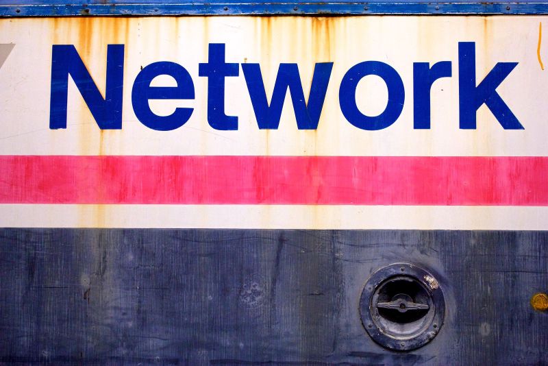
Apple built Helvetica into the original Macintosh system in 1984, by which point the typeface was already nearly thirty years old. Massimo Vignelli was an early champion of the design. Through his intervention, Helvetica became the official typeface for New York’s signs at the end of 1989, from road signs to the subway and railway. It replaced the Standard typeface the city had used before.
Neue Helvetica, a digitised revision, followed in 1983, and the typeface has since featured in a Museum of Modern Art exhibition and a documentary film. Google and Apple have since built their own, more versatile typefaces for small screens. Monotype, the company that now owns Helvetica’s licensing rights, then spent five years redrawing it for digital use. Monotype’s director, Charles Nix, said the typeface had to work across “every manner of output and device.” The result, Helvetica Now, reached the market in 2019.
The typeface Hoffmann commissioned to compete with one German foundry now sits in logos for companies including Lufthansa and Panasonic. Miedinger drew it to solve a problem for one Swiss foundry. Decades later, Monotype is still redrawing it for a screen he never saw.