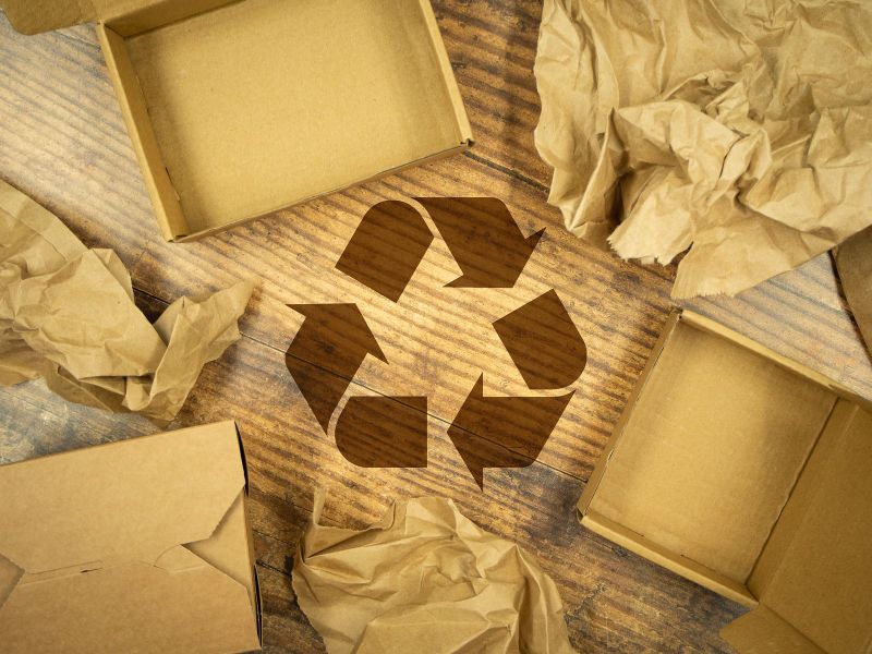
Gary Anderson was 23, studying architecture at the University of Southern California, when he entered a design contest in 1970 and won. His prize was $2,500, and his logo is now recognised around the world: three bent arrows chasing each other around a triangle.
more
A Chicago container company ran the contest to mark the first Earth Day, held on 22 April 1970, and asked entrants for a logo for recycled paper products. Anderson’s entry won. The mark he drew in pencil and traced in black ink has stood for five decades since.
Where the arrows came from
Anderson didn’t start from a blank page, and by his own account the design took him only a day or two. He had recently finished a presentation on recycling waste water, for which he’d sketched a graphic showing water moving from reservoir to consumption, so arrows and arcs were already in his head when the contest was announced.
The breakthrough came from a much older memory. As a schoolchild, Anderson had taken a field trip to a newspaper office and watched paper feed over rollers as it printed. He drew on that image for his final design: the three arrows in his sketch look like strips of paper folding over one another, rather than a flat, two-dimensional loop. Fast Company ranks the result as a design classic alongside the Coca-Cola and Nike marks, for sheer ubiquity.
The design remains in the public domain. It now appears on everything from milk cartons to shampoo bottles. He didn’t go on to build a career in graphic design. He became an architect instead, and by his own account later found himself frustrated by environmental regulation from time to time.
How three arrows became a warning label
The symbol Anderson drew to promote recycling has spent recent years being scrutinised for doing the opposite. By 2023, officials in the Biden administration were weighing whether the chasing arrows had become misleading, because manufacturers print it on packaging that is not routinely accepted for recycling.
The US Environmental Protection Agency told the Federal Trade Commission, which was updating its rules on environmental marketing claims, that it was fielding constant public queries about what the symbol meant on a given product. The problem sits with a number, not the arrows. Plastics stamped with a resin code of 1 or 2, used for bottles and jugs, are broadly recyclable. Codes 3 to 7, covering plastic bags, styrofoam and plastic trays, mostly are not. The EPA said placing the arrows on those harder-to-recycle plastics “does not accurately represent recyclability” and ignores that many have no functioning market to be recycled into.
California had already acted. In 2021, the state passed a law restricting use of the logo to avoid misleading claims about recycling. Environmental campaigners argue the symbol’s blanket use amounts to greenwashing. Greenpeace’s oceans campaigner, John Hocevar, said corporations were “hiding behind the pretense that their throwaway packaging is recyclable.”
The scale of the gap explains the pressure. Only around 5% of plastic is recycled in the United States, a share that has fallen since China stopped accepting other countries’ plastic waste in 2018. American households alone generate roughly 51 million tons of plastic waste a year, most of it landfilled, incinerated or littered.
None of that argues Anderson’s design failed. It argues the arrows were built for a different job: nudging a reader toward a bin, not certifying what happens after the truck leaves. Whether regulators eventually narrow where the symbol can legally appear will decide whether the mark keeps meaning what Anderson intended, or keeps meaning whatever a packaging designer wants it to.