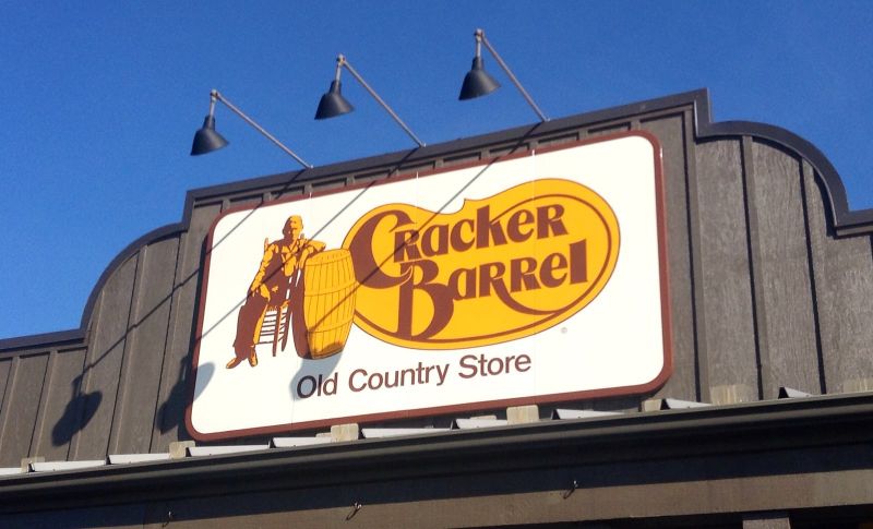
Cracker Barrel unveiled a stripped-down logo on 19 August 2025, dropping the “Old Timer” who had leaned against a barrel on its signage since 1977. Customers, investors and even President Trump objected, and within a week the chain had brought the old mark back. David Johnson, who runs the branding agency Strategic Vision PR Group, called the redesign a “flop” in comments to CBS, the BBC’s American partner network. The company had “gone against their brand story,” he said, rather than against good design.
more
The numbers behind the reversal were steep. Cracker Barrel’s shares fell more than 10% in the days after the launch, wiping out the stock’s gains for the year, and later recovered some ground once the reversal was announced. Trump posted that the company should go back to the old logo, and said it had “a Billion Dollars worth of free publicity” if it played its cards right. The rival chain Steak ’n Shake mocked the redesign on social media. Cracker Barrel itself admitted in a statement, “we said we would listen, and we have.”
Why the reaction lands so fast
Gap ran into the same wall in 2010. It swapped a dark blue square and serif wordmark for a smaller box set in plain Helvetica. Within 24 hours, one blog had drawn 2,000 negative comments, and a site for making parody logos collected almost 14,000. Gap’s vice-president of corporate communications, Bill Chandler, called the new mark “a more contemporary, modern expression” days before the company reverted to the old design.
Both companies discovered the same thing at speed: a logo is not judged as a picture. It is judged as a promise about who the company still is, and a sudden change reads as the promise breaking.
Who takes the blame
The branding agency DSNRY argues that a failed redesign is almost never one designer’s error. Dozens of people across marketing, legal and the executive suite typically approve a logo before it reaches the public, and each round of sign-off pulls the design further from its original brief. When a rebrand backfires, DSNRY writes, the public response still “blames the designer” rather than the committee that waved it through.
Brand strategist Alicia Nagel, quoted by Bored Panda, points to a different failure inside the same process: a company that suddenly claims to be something it never was before. A rebrand fails, she says, when a firm “decides it is something that it isn’t,” and customers who feel misled stop trusting the brand.
Not every backlash forces a reversal this quickly. Uber dropped its recognisable “U” mark for an abstract shape in 2016. The design drew mixed reactions and lasted only two years before a 2018 redesign. MySpace’s 2010 overhaul lasted about as long before the platform reverted to something closer to its original look. Cracker Barrel and Gap stand apart because each gave up its new logo within a week.