Britain’s road signs have carried the same design since 1965. That year Britain officially adopted the system Jock Kinneir and Margaret Calvert had spent most of a decade building. The system has “changed very little since,” and the Guardian calls it “a house style for Britain.” Michael Wolff, chairman of the Sign Design Society, puts what any sign has to do in three words: clarity, consistency, simplicity.
more
What the shape tells you before the words do
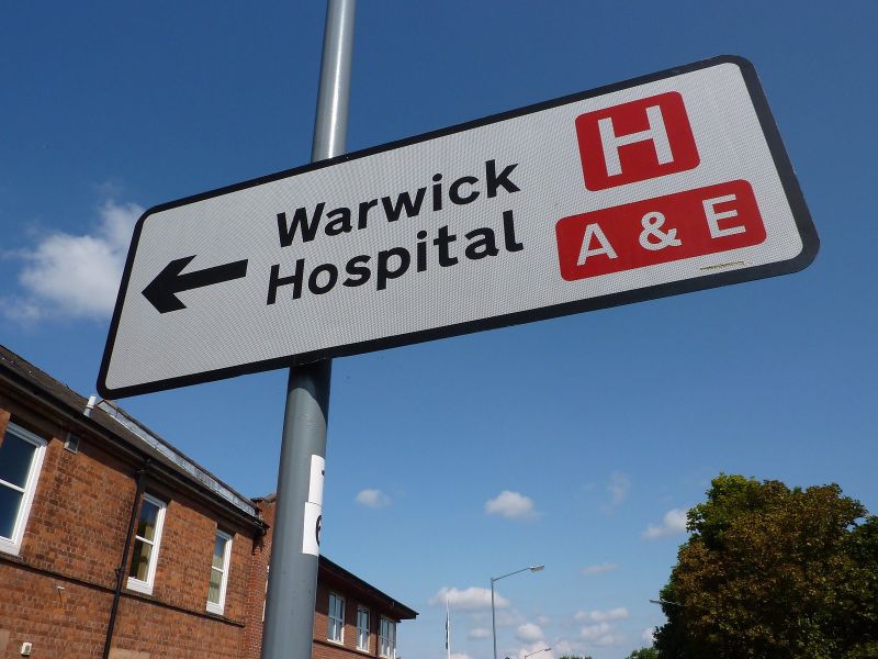
A circular sign gives an order. Red-bordered circles rule something out, such as a U-turn. Blue circles give a positive instruction, such as turning left ahead. A triangular sign, almost always outlined in red, warns of a hazard ahead rather than commanding anything. Rectangles inform rather than instruct. Blue ones carry motorway information, green ones direct traffic on primary roads, and white ones give directions on minor roads.
Colour psychologist David Cowell told the BBC the shapes carry their own logic independent of what’s printed on them. “A triangular sign has points and represents danger,” he said, which is why the shape is reserved for warnings. A rectangle, he said, is “the same shape as a book and therefore gives information,” while a round sign reads as an instruction because it resembles “the end of a pointing finger.” Colour does similar work before a driver reads a single word. Cowell says blue, the colour of motorway signage, “suggests harmony and relaxation,” while orange and yellow “suggest a positive future,” which is presumably the point of colouring the signs around a stretch of roadworks a driver is glad to see the back of.
What Britain’s system replaced
Kinneir and Calvert weren’t starting from a blank page. Before them, Britain’s roads carried decades of overlapping, inconsistent signage that the Guardian calls “a colossal undertaking” to untangle. Much of that patchwork began with cyclists rather than drivers. By the early 1880s, three clubs were each erecting their own cast-iron “danger boards” to warn riders of hazards ahead, rather than simply naming a destination. They were the Cyclists’ Touring Club, the National Cyclists’ Union and the Scottish Cyclists’ Union. Their lobbying helped move roads into county council ownership from 1888, funded by taxation instead of tolls, and county councils spent the rest of the century adding their own semi-standard direction signs and mileposts. Once motoring took off after 1896, motoring clubs such as the Automobile Association added their own signs on top of what was already there. By the time Kinneir and Calvert were commissioned, every one of those bodies had left its own idea of what a sign should look like behind.
What Calvert drew into the pictures
Calvert designed many of the pictograms herself, including the leaping deer and cantering horse, both drawn from Eadweard Muybridge’s photographic studies of animals in motion. The farm-animal warning sign shows a single static cow, modelled on a real cow named Patience that Calvert had encountered on a relative’s farm in Wiltshire. The children-crossing sign shows a girl with a bobbed haircut leading a smaller boy by the hand. Calvert based the girl on herself, and she leads the boy rather than the other way round.
Why the sign count keeps being a fight
Department for Transport research found the number of traffic signs on Britain’s roads had doubled over the previous twenty years. Cutting that clutter was an aim of the 2016 update to the Traffic Signs Regulations and General Directions. Patrick McLoughlin, transport secretary at the time, put Sir Alan Duncan MP in charge of a task force on the problem. The circular that transport minister Andrew Jones launched said the changes gave local authorities more tools against “the scourge of too many signs.”
Where the design still loses drivers
Good intentions don’t guarantee recognition. In a survey of 500 drivers, not one could correctly identify twelve common road signs, and only the speed camera sign was known to every single one of them. Many drivers don’t recognise the “no stopping” sign at all. Chris Walker, a former police driving instructor, says the “give way to oncoming traffic” sign is hotly debated in driving lessons because it takes too long to work out. The sign showing stooped elderly people crossing a road has drawn criticism from the charity Help the Aged, which calls it insulting. It began life in a children’s design competition in 1981.
A system built for strangers too
Paul Watters, the AA’s head of roads policy, points out that more than a million foreign-registered cars are on Britain’s roads at any one time. A sign also has to work for a driver who has never met Kinneir and Calvert’s system before. British signage conforms broadly to the Vienna Convention on Road Signs and Signals, an international standard for road signs. What marks a British sign out are the details a local driver barely notices. Distances are given in miles rather than kilometres, and place names carry Welsh alongside English in Wales, or Scottish Gaelic in parts of Scotland.